

Google has been moving towards mobile-first indexing for several years now. Mobile-first indexing is already enabled on the majority of crawled sites, and all new sites are mobile-first indexing enabled by default. In March 2021 Google is taking the final step to enable mobile-first indexing on ALL sites.
In this blog, we’ll look at:
- Why is Google switching to mobile-first indexing?
- How mobile-first indexing will affect your website rankings?
- What you can do to prepare for this shift to mobile-first indexing?
Contents
Why is Google Enabling Mobile-First Indexing?
With the emergence of smartphones and relentless advancements in technology, internet usage has shifted from predominantly desktop to mostly mobile in a decade. At the start of 2010, desktop accounted for more than 98% of global internet use. As of December 2020, this figure has fallen to just 41% of market share.
Mobile internet usage took the lion’s share back in 2016 and it’s easy to see why when we look at some statistics. Today there are over 3.5 billion mobile users worldwide with 2021 forecasted to reach 3.8 billion.
The vast majority of adults in the developed world have smartphones. While the most rapid growth of mobile usage is happening in the developing world where around 45% of the population have access to a smartphone.
 While over half of all searches are on mobiles, the swing to mobile over desktop doesn’t stop there. More than half of all B2B enquiries are now made on mobile. And at least 50% of emails are opened on mobiles, with 81% preferring to open emails on mobile devices. With younger demographic groups leaning further towards mobile than older ones, these trends will only strengthen.
How Will Mobile-First Indexing Affect My Website?
With more searches now made on mobile devices, Google thinks the time is right to prioritise mobile over desktop and enable mobile-first indexing on all sites. So how will mobile-first indexing affect your website rankings?
Well, first of all, let’s be clear that Google only has one index from which the results are served, there is no separate mobile-first index.
Stay Calm, Keep Ranking.
If you already have a mobile version of your site, Google will use the content of your mobile site to determine where you will rank.
If your site is responsive, which most WordPress sites are, there should be minimal fallout from mobile-first indexing. This is due to having the same content available on both desktop and mobile. Although you will still need to do a mobile friendly audit (see below for key items on your checklist). This will ensure that your site is optimised for user experience on mobile devices.
If you have different website versions for mobile and desktop then you may have a long to-do list. You’ll need to ensure that the content on your desktop site is also on the mobile version. This should also include metadata such as titles and descriptions, structured data, along with robots meta tags. A process you may find time consuming.
What Can I Do to Prepare my Website for Mobile-First Indexing?
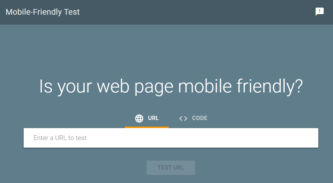
Mobile Friendly Test
To begin with, it is vital to do a mobile friendly audit. Simply put, if your website is not mobile friendly then it will become more difficult to rank.
And the best place to start is with Google’s own Mobile Friendly Test. Google has also published guidance on how to prepare for mobile-first indexing.
Mobile Page Speed
With attention spans waning and competition for that dwindling attention increasing, the time it takes for your website to load is critical. These days many users expect a web page to load in 2 seconds or less, with 40% of people abandoning a website with a load time of longer than 3 seconds.
Google knows this and includes page speed as a factor when indexing and ranking a webpage, and mobile-first indexing will be no different. So remove unnecessary clutter to optimise for quick loading and be sure to check your web hosting too.
Mobile UX
Google has always had a user-centric approach and this latest update to mobile-first indexing will continue with this theme so focus on the user experience on mobile devices.
Due to the difference in screen size, mobile sites need to adopt a variation in design to desktop versions. But don’t fall into the trap of stripping back your desktop content for your mobile version as this won’t help your ranking positions.
Think about the design from a mobile user’s perspective. Are clickable items easy to click? Can content be clearly read without needing to pinch zoom? Are images optimised correctly? Is your site easy to navigate?
The use of hamburger menus and accordions has been confirmed by Google as totally fine to use. While it’s also worth considering Scroll-to-Top widgets along with sticky headers and call to action buttons.
Readability
Reading from a screen can be difficult, especially when the screen can fit in your pocket. Try to keep sentences short and paragraphs concise. Ensuring there is adequate white space and that fonts are large enough will go a long way to improving readability.
Having content behind tabs can also make digesting information a little easier while also helping to achieve a better user experience. Think about the length of your headers and see if you can condense them so that they work well for smaller screens, ensuring your target keywords are still there of course.
Mobile Snippets
Check your analytics to see if the majority of your organic website visitors are on mobile. If so, then it’s a good idea to see how your website is displayed in the SERPs. There are free tools out there which can generate a preview of mobile snippets to help you optimise for mobile search results and get you ready for mobile-first indexing.

Are You Ready for Mobile-First Indexing?
Does your website have a responsive design? If the answer is yes then it is likely that your site content will be similar for desktop and mobile, but it’s a good idea to double check it.
If you have different versions of your site for mobile and desktop then you’ll need to take the time to review the content and ensure there are no gaps.
Whether you have a responsive design or separate mobile version you’ll still want to carry out a mobile-friendly audit to confirm your site is optimised for mobile users. This will help you identify areas for improvement so you don’t fall foul of mobile-first indexing.
Pay attention to the design, UX and readability to give your mobile visitors the best possible experience. They will thank you, and so will Google.
Still concerned about mobile-first indexing or wondering where to begin? We’re here to help. For more information, expert advice or to discuss your requirements get in touch today.