Think of any well-known company, and one of the first things you think of is the company logo. Famous corporate logos include Coca-Cola and Disney’s wordmarks or the simple graphic icons used by Apple and Nike. The fact that these are so readily associated with these famous brands demonstrates how powerful having a great logo can be.
When creating a logo for a new company or refreshing an existing brand, there a couple of things that are important to consider to help you on your way to designing a great company logo.
Contents
A Company Logo that is Simple and Scalable
These days, logos are used in a wide variety of places from business cards to billboards and from websites to building facades. If a business logo is going to be used in a variety of sizes and applications, it is important to keep it simple. A more complex logo may look great on a billboard or a large screen, but it may not translate as well to a business card or a website viewed on a mobile phone screen.
Not every logo follows the simplicity principle. Porsche, for example has a very detailed logo that contains a variety of different elements.
However, the Porsche logo was last redesigned in 1963, long before websites were a consideration. Porsche is also a bit of an outlier, motoring company logos have trended towards simpler designs in recent years.
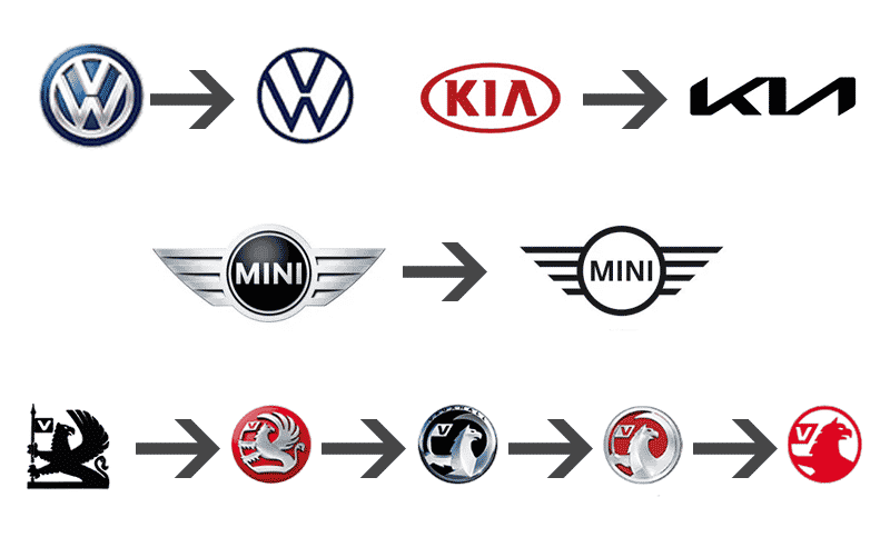
This is evidenced by Volkswagen, KIA and Mini’s recent refreshes. Vauxhall has also refreshed their logo many times since 1983, and there has been a general trend towards a flatter, simpler design with the 2020 refresh stripping the logo right back to basics.
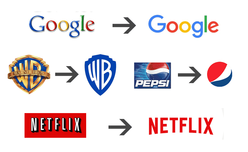
Away from the motor trade, Google, Warner Brothers, Netflix and Pepsi’s logos have all been refreshed with simpler, flatter designs over the last few years.
The Importance of Legibility and Brand Recognition in Company Logo Design
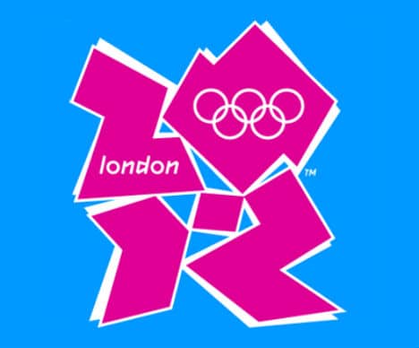
Any logo refresh must ensure that the company’s name is clearly readable. This is especially important for a company that is just starting out. The London 2012 Olympics logo was widely criticised at the time for its lack of legibility and clarity.
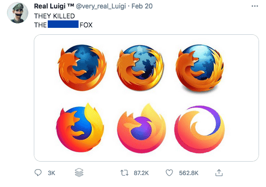
Mozilla’s recent logo redesign is undoubtedly very clever, by replacing the ‘ill’ in their name with ‘://’ they have incorporated an integral part of web addresses into their logo, signifying their deep connection to the internet.
However, most browsers now hide the ‘http://’ in the address window so Mozilla have compromised on legibility and may not have created the association that they were aiming for with many people. Mozilla have also drawn considerable online criticism for their increased flattening of the Firefox logo which many believe has gone too far.
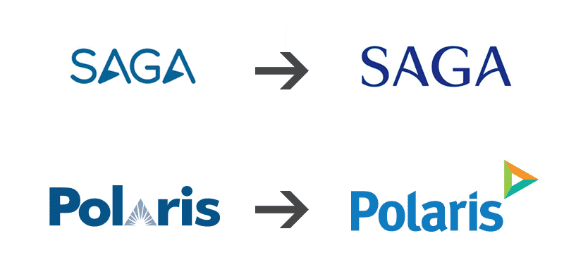
On the other side of this is Saga and Polaris whose recent logo refreshes have increased readability and accessibility.
How to Design a Company Logo
Prepare
Before starting a corporate logo design or redesign, preparation is key. For creative agencies, it is important to understand the client and their business.
SocialB always start our logo commissions with a logo questionnaire. This helps us to understand what our client likes and does not like and helps us get to a starting point much quicker.
Understand the Business and its Target Audience
A brand aimed at the over 50’s will require a different type of design than one aimed at teenagers. Similarly, a creative brand selling on Etsy will have a very different personality to communicate than a tech company. Making sure that any logo resonates with the people who are using the service is vital for creating a connection with the brand.
Begin your Logo Design on Paper
Even though the final logo will be designed using creative software, it is useful to sketch out on paper first to see what works and what doesn’t. Squared paper is very handy at this stage as it gives us the opportunity to look at the proportions of each element and to create a more symmetrical design.
It is sometimes easier to design in black and white at this stage because in certain cases, colour can add complexity and there will often be occasions where it is necessary to use a black and white version of a corporate logo, so it is imperative that the logo works both with colours and without.
Our logo questionnaire helps a lot at this point as it helps us to quickly narrow down to preferences of our client.
Design your Logo Using the Right Tools
There are many different programs that can be used to design a digital logo, however not all of them will create a suitable corporate logo.
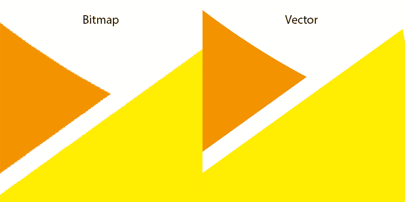
Many programs work with bitmaps (examples of which are .jpg and .png). These are widely used and are compatible with all software and systems. Bitmaps are made up of pixels and so the more you zoom in, the blockier the logo will look. This may not be an issue in some applications, but for larger versions of the logo, it can quickly start to look unprofessional.
An alternative is a vector logo. Because of the way that vector images work, it is possible to zoom in or out forever and not see a fuzzy line. This means that at every scale, your logo will always look perfect. SocialB always designs our logos using software that creates vector images. You may not be advertising your company on a billboard yet, but it is nice to have the reassurance that your logo will look exactly as you intended it however it is used.
Communication With the Client
A designer may create a logo that they are very happy with, but it may not resonate well with the person who will be using the logo. That is why it is important that the client is happy with the concepts and why feedback is so important throughout the design process.
Depending on the logo design package you choose, Social B will create two or three logos for you based on your answers in the questionnaire. We will then offer up to 5 revisions, to refine and tweak your logo, helping you towards a logo that perfectly represents your brand.
Logo Design services at SocialB
Visit the Logo Design service page to find out how SocialB can help you create the perfect logo for your business. Alternatively get in touch if you would like to speak to one of our design team.
